Sign Design Tips to get the most bang for your buck!
There is a strategy to highly effective sign design. Designing visually appealing signs isn't rocket science, though ignoring just one key design principle can drastically hurt the impact of your sign. Following design principles that graphic professionals use to create attractive, high impact custom signage will help you yield the greatest return on your advertising dollars.
Thoroughly reviewing the design tips listed below will help insure that you get the most for your money and maximize the return on your investment now and moving forward into the future. You are about to discover the answers to important design questions like:
- Is it easier to read ALL CAPITAL LETTERS?
- What are the most effective Font styles to use in signage?
- What is "White Space" and how can it make your sign more effective?
- When is it better to have less?
- What size letters should be used on your sign?
- What are the most effective color combinations to use?
- Should you have a border on your sign?
Secret # 1
Is it easier to read ALL CAPITAL LETTERS?
There is a misconception that exists that since ALL CAPITAL LETTERS are "larger" than lower case letters, they must be easier to read from a distance. However, visual tests have concluded that Upper And Lower Case Text is more legible from a distance than ALL UPPER CASE LETTERS. Since passing motorists may only have a few seconds to get your message, maximize the readability of your custom designed sign by not over using the use of CAPITAL letters.
We suggest that you stand back from your computer monitor to evaluate the design of your sign so as to get a better idea of what the text will look like from a distance.
Secret # 2
What are the most effective Font styles To Use In Signage?
Ineffective “designer” font styles are often chosen for signage in order to set make your sign distinctive. These fonts may look good on business cards and stationary, but can greatly diminish the effectiveness of a sign. To make matters worse, fancy type styles are often used completely wrong. For example, a  on a sign can be difficult enough to read but nobody should ever use on a sign can be difficult enough to read but nobody should ever use  ("ALL UPPER CASE SCRIPT") or ("ALL UPPER CASE SCRIPT") or 
In general, clean, crisp, easy-to-read type styles such as “Centurion Bold”, “Booker Bold” or “Ergonomic Bold” can be used for maximum legibility.
Variations of these same type styles, such as “Centurion Bold Italic” can also be used throughout the design.
The second most legible group of type styles includes the serif style of fonts. Serifs have short horizontal lines added to the tops and bottoms of traditional typefaces. An example of a serif style font is the “quartz bold” font seen in the list of design fonts offered on the SignsIDesign design software.There are several other fonts with similar looking serif type styles to choose from. Each letter style has its own unique, defining characteristics. The distinctions from one serif letter style to the next are often subtle.
* As a general rule of thumb, never use more than two different letter styles in a single sign design. The online design features at www.SignsIDesign.com allows you instantly select, view and revise type styles. By testing the different styles and combinations, a distinctive identity will emerge that will project your business image professionally.
Secret # 3
What is "White Space" and how can it make your sign more effective?
“White space” refers to the area of a design that has no text or graphics (white space can be a color). The empty space surrounding text and graphics is just as important as other design considerations. There is a tendency to want to "fill up" the available area with as much as possible. We have a lot to say so why waste the space.
So how is it that “white space” helps the effectiveness of a sign design? Basically text without sufficient white space makes the person reading the message feel cramped and rushed. When text is crowded, it becomes harder to read.
For best results, 30% to 40% of the sign's face area should be “white space” for optimal readability. Again, step back from your monitor to view your sign design. If you think it is too crowded, it probably is.
Secret # 4
When is it better to have less?
This design tip is conceptually similar to the “white space” discussed above.
Successful signage communicates a message concisely. A message, not multiple messages! The message should be conveyed in as few words as is possible to your target audience. Crowding your sign with too many words or lines of text makes it harder to read from a distance. When it comes to sign effectiveness, "Less Really Is Better".
Again, step back from your monitor to view your sign design. Try to put yourself in your potential customer’s shoes. Give yourself 2 to 5 seconds to view your design. If the message you are trying to communicate is not getting through, adjust your design.
Secret # 5
"What size letters should be used on your Sign?"
The United States Sign Council has recommended letter sizes in the “letter visibility chart” below. This chart tells the story. No need for us to elaborate.
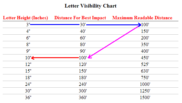
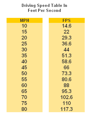
Speed is another factor that should be considered for signage visible from the street. The table below converts driving speed to “feet per second”.
Use the data in this table combined with the Letter Visibility Chart above to determine the amount of time potential customers will have to read a sign while driving. For example, an 8" letter is has a maximum readable distance of 350'. If a vehicle is traveling at 45 mph, then divide 350 feet by 66' feet per second (FPS) to determine that a driver will have 5.3 seconds to read the message.
Secret # 6
"What Are The Best Color Combinations To Use?"
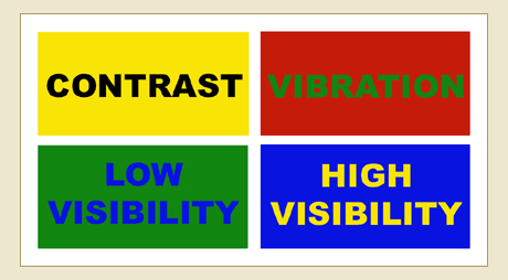
The effective use of color is vital to the effectiveness of a sign. So how exactly, do you use color "effectively", right?
The key is contrast. So what exactly is contrast? Contrast is the difference in brightness between the light and dark areas present in a single design. A bright yellow background for example, will contrast well with dark letters such as black, a dark shade of blue and even purple. The greater the contrast or difference between the light and the dark colors, the more legible text is from a distance. Colors that are closer together like a medium gray letter against a black background won't contrast as well and therefore will be more difficult to read.
 |
Contrast:
Take a look to your left. Which of the two looks larger... the white one? They are both the same size. The use of a light colored letter against a dark background lends to it seeming larger. Light letters tend to come at you, where dark tend to recede. |
Generally speaking, white as a background color is by far the most versatile because more colors naturally contrast better against a neutral white background than any other single color. When you choose a different background color for a custom sign other than white, you limit your choices for colors that will both stand out and "go with" that background color. That's not a good thing or a bad thing - it's just something to keep in mind when making color selections.
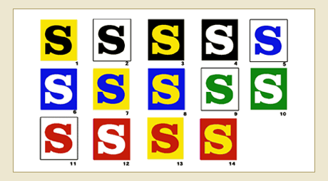
Comparing Visibility Of Different Color Combinations
These 14 color combinations for lettering were tested for readability at a distance. The test were carried out on different groups under the sponsorship of the Outdoor Advertising Association of America (OAAA). The results ranked in the sequence shown, with #1 the most legible and #14 as the least legible. Negative letters in 3, 4, 6, 8, 10, 12 and 14 appear to be larger in appearance than their positive counterparts.
Color Combination Effects |
|
Contrast Solutions |
 |
Weak color contrasts can be strengthened with an outline and/or drop shadow. |
Colors create a mood, a perception, a feeling and speak very loud to our subconscious generating either a positive or a negative reaction within seconds. Consider the psychological characteristics of color when making your selections.
BLACK suggests authority, power, boldness, seriousness, professionalism, is distinguishing and classic. Business wise, it's great for creating drama and is good for a background color. It is ideal for text on a light background.
BLUE suggests security, authority, faithfulness and dignity. For business it suggests sanctuary and fiscal responsibility. It is the most popular and the second most powerful color. Blue can also be cold. People are more productive in blue rooms.
BROWN suggests richness, politeness, helpfulness and effectiveness. In business it suggests less important items. Solid, reliable brown is the color of earth and is abundant in nature. Light brown implies genuineness while dark brown is similar to wood or leather.
GRAY suggests authority, practicality, earnestness and creativity. Business wise it is traditional and conservative.
GREEN suggests health, fertility, freedom, freshness, healing, tranquility and jealousy. Businesses use it to communicate status and wealth. It is the easiest color on the eye and can improve vision. It is a calming, refreshing color.
ORANGE suggests pleasure, cool, excitement, cheer, endurance, strength and ambition. For business it is good for highlighting information on charts and graphs.
PINK suggests femininity, gentleness, well being and innocence. For business you must be aware of it's feminine links and implications.
PURPLE suggests spirituality, royalty, luxury, wealth, sophistication, authority and mournfulness. In business it is upscale and works with artistic types. It is also feminine and romantic. However, because it is rare in nature, purple can appear artificial.
RED suggests excitement, strength, sex, passion, vitality, aggressiveness and commands attention. Business wise it's associated with debt, is great for boldness and accents. The most emotionally intense color, red stimulates a faster heartbeat and breathing.
WHITE suggests refinement, purity, devotion, contemporary and truthfulness. For business it can be sterile and refreshing.
YELLOW suggests warmth, sunshine, cheer, happiness, jealousy, deceit and cowardice. Business wise it appeals to the intellectual types and is a good accent. Yellow enhances concentration, hence its use for legal pads. It also speeds metabolism. It is the most difficult color for the eye to take in, so it can be overpowering if overused.
People respond more to non verbal cues than verbal ones. Make sure you use the psychology of colors in all your marketing, especially when you can't be face to face.
Secret # 7
Should you have a border on your sign?
Adding a border can increase reading speed by up to 25%. Borders are often recommended whenever automobile traffic is the intended audience. They tend to cause the eye to focus on the message.
In addition, full-color digital photos can be incorporated into designs to add greater impact. Logos, artwork and other graphical elements can also be added to visually stimulate the viewer towards the desired action.
SignsIDesign offers you the ability to create your own signs online. No one knows your business better than you do. No one cares about your success as much as you do. Our site offers you the tools to leverage your unique business knowledge into your sign design so as to maximize your marketing efforts.
|
 d
d